Checkbox :
The classic checkbox has two states:
- checked and
- unchecked.
Clicking the checkbox toggles between those states to indicate a choice.
In Android, there is a CheckBox widget to meet this need. It has TextView as an ancestor, so you can use TextView properties like android:textColor to format the widget.
Within Java, you can invoke:
- isChecked() to determine if the checkbox has been checked
- setChecked() to force the checkbox into a checked or unchecked state
- toggle() to toggle the checkbox as if the user clicked upon it
You can register a listener object (in this case, an instance of OnCheckedChangeListener) to be notified when the state of the checkbox changes.
Simple checkbox layout :
<CheckBox xmlns:android="http://schemas.android.com/apk/res/android"
   android:id="@+id/check"
   android:layout_width="wrap_content"
   android:layout_height="wrap_content"
   android:text="@string/unchecked"/>
The Java code to retrieve and configure the behavior of the checkbox :
public class CheckBoxDemo extends Activity implements CompoundButton.OnCheckedChangeListener {
  CheckBox cb;

  @Override
  public void onCreate(Bundle icicle) {
    super.onCreate(icicle);
    setContentView(R.layout.main);

    cb=(CheckBox)findViewById(R.id.check);
    cb.setOnCheckedChangeListener(this);
  }

  public void onCheckedChanged(CompoundButton buttonView, boolean isChecked) {
    if (isChecked) {
      cb.setText(R.string.checked);
    }
    else {
      cb.setText(R.string.unchecked);
    }
  }
}
Note that the activity serves as its own listener for checkbox state changes since it implements the OnCheckedChangeListener interface (set via cb.setOnCheckedChangeListener(this)).
The callback for the listener is onCheckedChanged(), which receives the checkbox whose state has changed and
what the new state is. In this case, we update the text of the checkbox to reflect what the actual box contains.
—->>>>
As CheckBox inherits from TextView, most of the settings are the same as those you would find on a regular TextView.
Don’t Like Checkboxes? How About Toggles or Switches?
A similar widget to CheckBox is ToggleButton. Like CheckBox, ToggleButton is a two-state widget that is either checked or unchecked. However, ToggleButton has a distinct visual appearance.
Toggle button in XML layout :
<ToggleButton xmlns:android="http://schemas.android.com/apk/res/android"
    android:id="@+id/toggle"
    android:layout_width="wrap_content"
    android:layout_height="wrap_content" />
You can also set up an OnCheckedChangeListener to be notified when the user changes the state of the ToggleButton.
public class ToggleButtonDemo extends Activity implements CompoundButton.OnCheckedChangeListener {
  ToggleButton tb;

  @Override
  public void onCreate(Bundle icicle) {
    super.onCreate(icicle);
    setContentView(R.layout.main);

    tb = (ToggleButton)findViewById(R.id.toggle);
    tb.setOnCheckedChangeListener(this);
  }

  public void onCheckedChanged(CompoundButton buttonView, boolean isChecked) {
    if (isChecked) {
      Toast.makeText(this, R.string.toggle_on, Toast.LENGTH_LONG).show();
    }
    else {
      Toast.makeText(this, R.string.toggle_off, Toast.LENGTH_LONG).show();
    }
  }
}
Switch widget :
Android has a Switch widget, showing the state via a small “ON/OFF” slider.
Switch, like CheckBox and ToggleButton, inherits from CompoundButton, and therefore shares a common API, for methods like toggle(), isChecked(), and setChecked().
<Switch xmlns:android="http://schemas.android.com/apk/res/android"
    android:id="@+id/switchSlider"
    android:layout_width="wrap_content"
    android:layout_height="wrap_content" />
Java code :
public class SwitchDemo extends Activity implements CompoundButton.OnCheckedChangeListener {
  Switch sb;

  @Override
  public void onCreate(Bundle icicle) {
    super.onCreate(icicle);
    setContentView(R.layout.main);

    sb = (Switch)findViewById(R.id.switchSlider);
    sb.setOnCheckedChangeListener(this);
  }

  public void onCheckedChanged(CompoundButton buttonView, boolean isChecked) {
    if (isChecked) {
      Toast.makeText(this, R.string.switch_on, Toast.LENGTH_LONG).show();
    }
    else {
      Toast.makeText(this, R.string.switch_off, Toast.LENGTH_LONG).show();
    }
  }
}
The biggest limitation with Switch is that it was only added to the Android SDK in API Level 14. It is simplest to only use Switch if your minSdkVersion is set to 14 or higher.
RadioButton and RadioGroup :
Android’s radio buttons are two-state, like checkboxes, but can be grouped such that only one radio button in the group can be checked at any time.
CheckBox, ToggleButton, Switch, and RadioButton all inherit from CompoundButton, which in turn inherits from TextView.
Most times, you will want to put your RadioButton widgets inside of a RadioGroup.
The RadioGroup is a LinearLayout that indicates a set of radio buttons whose state is tied, meaning only one button out of the group can be selected at any time.
If you assign an android:id to your RadioGroup in your XML layout, you can access the group from your Java code and invoke:
- check() to check a specific radio button via its ID (e.g., group.check(R.id.radio1))
- clearCheck() to clear all radio buttons, so none in the group are checked
- getCheckedRadioButtonId() to get the ID of the currently-checked radio button (or -1 if none are checked)
Note that the mutual-exclusion feature of RadioGroup only applies to RadioButton widgets that are immediate children of the RadioGroup. You cannot have other containers between the RadioGroup and its RadioButton widgets.
The Layout of RadioGroup and having RadioButton widgets look like this :
<RadioGroup
  xmlns:android="http://schemas.android.com/apk/res/android"
  android:id="@+id/radiogrp"
  android:orientation="vertical"
  android:layout_width="match_parent"
  android:layout_height="match_parent"  >
    <RadioButton android:id="@+id/radio1"
      android:layout_width="wrap_content"
      android:layout_height="wrap_content"
      android:text="@string/rock" />

    <RadioButton android:id="@+id/radio2"
      android:layout_width="wrap_content"
      android:layout_height="wrap_content"
      android:text="@string/scissors" />

    <RadioButton android:id="@+id/radio3"
      android:layout_width="wrap_content"
      android:layout_height="wrap_content"
      android:text="@string/paper" />
</RadioGroup>
Working with RadioButton in Java :
public class RadioButtonDemo extends Activity implements View.OnClickListener {
  @Override
  public void onCreate(Bundle icicle) {
    super.onCreate(icicle);
    setContentView(R.layout.main);

    setupClickListener(R.id.radio1);
    setupClickListener(R.id.radio2);
    setupClickListener(R.id.radio3);
  }

  private void setupClickListener(int childViewId) {
    View childView = findViewById(childViewId);
    childView.setOnClickListener(this);
  }

  public void onClick(View view) {
    int id = view.getId();
    String radioButtonText = "";

    switch (id) {
      case R.id.radio1:
        radioButtonText = getString(R.string.rock);
        break;
      case R.id.radio2:
        radioButtonText = getString(R.string.scissors);
        break;
      case R.id.radio3:
        radioButtonText = getString(R.string.paper);
        break;
    }

    Toast.makeText(this, radioButtonText + " is selected!!", Toast.LENGTH_LONG).show();
  }
}
[Default] Note that the radio button group is initially set to be completely unchecked at the outset.
To preset one of the radio buttons to be checked, use either setChecked() on the RadioButton or check() on the RadioGroup from within your onCreate() callback in your activity. Alternatively, you can use the android:checked attribute on one of the RadioButton widgets in the layout file.
RelativeLayout
My notes on RelativeLayout:
https://drive.google.com/file/d/0B8Lj8J3LPGs0aXd2bHpWWU56ems/view?usp=sharing
RelativeLayout, as the name suggests, lays out widgets based upon their relationship to other widgets in the container and the parent container. You can place Widget X below and to the left of Widget Y, or have Widget Z’s bottom edge align with the bottom of the container, and so on.
Positions Relative to Container(Parent)
The easiest relations to set up are tying a widget’s position to that of its container:
- android:layout_alignParentTop says the widget’s top should align with the top of the container
- android:layout_alignParentBottom says the widget’s bottom should align with the bottom of the container
- android:layout_alignParentLeft says the widget’s left side should align with the left side of the container
- android:layout_alignParentRight says the widget’s right side should align with the right side of the container
- android:layout_centerHorizontal says the widget should be positioned horizontally at the center of the container
- android:layout_centerVertical says the widget should be positioned vertically at the center of the container
- android:layout_centerInParent says the widget should be positioned both horizontally and vertically at the center of the container
All of these properties take a simple boolean value (true or false).
Positions Relative to Other Widgets
The remaining properties of relevance to RelativeLayout take as a value the identity of a widget in the container. To do this:
- Put identifiers (android:id attributes) on all elements that you will need to address
- Address these widgets from other widgets using the identifiers
- android:layout_above indicates that the widget should be placed above the widget referenced in the property
- android:layout_below indicates that the widget should be placed below the widget referenced in the property
- android:layout_toLeftOf indicates that the widget should be placed to the left of the widget referenced in the property
- android:layout_toRightOf indicates that the widget should be placed to the right of the widget referenced in the property
- android:layout_alignTop indicates that the widget’s top should be aligned with the top of the widget referenced in the property
- android:layout_alignBottom indicates that the widget’s bottom should be aligned with the bottom of the widget referenced in the property
- android:layout_alignLeft indicates that the widget’s left should be aligned with the left of the widget referenced in the property
- android:layout_alignRight indicates that the widget’s right should be aligned with the right of the widget referenced in the property
- android:layout_alignBaseline indicates that the baselines of the two widgets should be aligned (where the “baseline” is that invisible line that text appears to sit on)
android:layout_alignBaseline –> useful for aligning labels and fields so that the text appears “natural”.
Example:
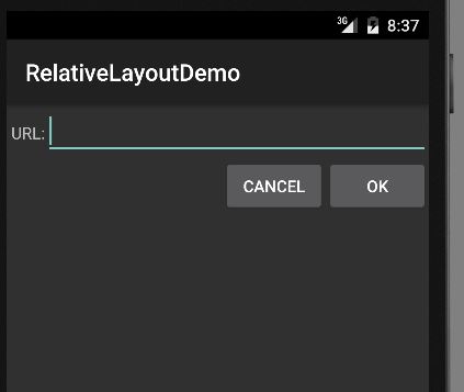
With all that in mind, let’s examine a typical “form” with a field, a label, plus a pair of buttons labeled “OK” and “Cancel”.
Here is the XML layout :
<?xml version="1.0" encoding="utf-8"?>
<RelativeLayout
  xmlns:android="http://schemas.android.com/apk/res/android"
  android:layout_width="match_parent"
  android:layout_height="wrap_content">

  <TextView
   android:id="@+id/label"
   android:layout_width="wrap_content"
   android:layout_height="wrap_content"
   android:layout_alignBaseline="@+id/entry"
   android:layout_alignParentLeft="true"
   android:layout_marginLeft="4dip"
   android:text="@string/url"/>

  <EditText
   android:id="@id/entry"
   android:layout_width="match_parent"
   android:layout_height="wrap_content"
   android:layout_alignParentTop="true"
   android:layout_toRightOf="@id/label"
   android:inputType="text"/>

  <Button
   android:id="@+id/ok"
   android:layout_width="wrap_content"
   android:layout_height="wrap_content"
   android:layout_alignRight="@id/entry"
   android:layout_below="@id/entry"
   android:text="@string/ok"/>

  <Button
   android:id="@+id/cancel"
   android:layout_width="wrap_content"
   android:layout_height="wrap_content"
   android:layout_alignTop="@id/ok"
   android:layout_toLeftOf="@id/ok"
   android:text="@string/cancel"/>

</RelativeLayout>
With no changes to the auto-generated Java code, the emulator gives us:
Overlap
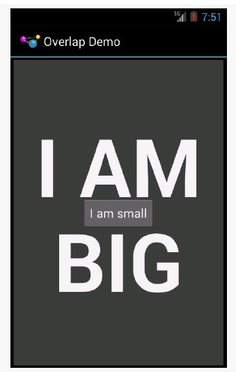
RelativeLayout also has a feature that LinearLayout lacks — the ability to have widgets overlap one another.
Later children of a RelativeLayout are “higher in the Z axis” than are earlier children, meaning that later children will overlap earlier children if they are set up to occupy the same space in the layout.
Example:
<?xml version="1.0" encoding="utf-8"?>
<RelativeLayout xmlns:android="http://schemas.android.com/apk/res/android"
   android:layout_width="match_parent"
   android:layout_height="match_parent">

   <Button
      android:layout_width="match_parent"
      android:layout_height="match_parent"
      android:text="@string/big"
      android:textSize="120dip"
      android:textStyle="bold"/>

   <Button
      android:layout_width="wrap_content"
      android:layout_height="wrap_content"
      android:layout_centerInParent="true"
      android:text="@string/small"/>

</RelativeLayout>
The first Button is set to fill the screen. The second Button is set to be centered inside the parent, but only take up as much space as is needed for its caption.
Hence, the second Button will appear to “float” over the first Button.
NOTE: There is a bug in the layout editor that renders the RelativeLayout incorrectly on Android Studio, if your preview is set to API Level 21. If you drop the preview to API Level 19, the RelativeLayout renders correctly. And, running the app
on a device shows that the RelativeLayout renders correctly, even on Android 5.0.
TableLayout
If you like HTML tables, you will like Android’s TableLayout. It allows you to position your widgets in a grid to your specifications. You control the number of rows and columns, which columns might shrink or stretch to accommodate their
contents, and so on.
TableLayout works in conjunction with TableRow.
TableLayout controls the overall behavior of the container, with the widgets themselves poured into one or more
TableRow containers, one per row in the grid.
My notes:
https://drive.google.com/file/d/0B8Lj8J3LPGs0QkZ4aHY1VHlYQms/view?usp=sharing
Putting Cells in Rows
Rows are declared by you, the developer, by putting widgets as children of a TableRow inside the overall TableLayout. You, therefore, control directly how many rows appear in the table.
Scrollwork
Phone screens tend to be small, which requires developers to use some tricks to present a lot of information in the limited available space. One trick for doing this is to use scrolling, so only part of the information is visible at one time, the rest
available via scrolling up or down.
ScrollView is a container that provides scrolling for its contents.
You can take a layout that might be too big for some screens, wrap it in a ScrollView, and still use your existing layout logic. It just so happens that the user can only see part of your layout at one time, the rest available via scrolling.
Android also has HorizontalScrollView, which works like ScrollView… just horizontally. This would be good for forms that might be too wide rather than too tall. Note that ScrollView only scrolls vertically and HorizontalScrollView only
scrolls horizontally.
———>>>>
And, a ScrollView or HorizontalScrollView can only have one child — if you want more than one, wrap the children in a suitable container class (e.g., a LinearLayout) and put that inside the ScrollView or HorizontalScrollView.
Also, note that you cannot put scrollable items into a ScrollView. For example, a ListView widget already knows how
to scroll. You do not need to put a ListView in a ScrollView, and if you were to try, it would not work very well.
Making Progress with ProgressBars
If you are going to fork background threads to do work on behalf of the user, you will want to think about keeping the user informed that work is going on. This is particularly true if the user is effectively waiting for that background work to
complete.
The typical approach to keeping users informed of progress is some form of progress bar, like you see when you copy a bunch of files from place to place in many desktop operating systems. Android supports this through the ProgressBar widget.
A ProgressBar keeps track of progress, defined as an integer, with 0 indicating no progress has been made.
You can define the maximum end of the range — what value indicates progress is complete — via setMax(). By default, a ProgressBar starts with a progress of 0, though you can start from some other position via setProgress().
—->>>>
If you prefer your progress bar to be indeterminate — meaning that it will show a general animated effect, rather than a specific amount of progress – use setIndeterminate(), setting it to true.
In your Java code, you can either positively set the amount of progress that has been made (via setProgress()) or increment the progress from its current amount (via incrementProgressBy()). You can find out how much progress has been made via getProgress().
In general, to help assure the user that their device has not frozen, we will add a ProgressBar to our user interface.
<ProgressBar
    style="?android:attr/progressBarStyleLarge"
    android:layout_width="wrap_content"
    android:layout_height="wrap_content"
    android:id="@+id/progressBar1"
    android:layout_centerVertical="true"
    android:layout_centerHorizontal="true" />
Including Includes
Sometimes, you have a widget or a collection of widgets that you want to reuse across multiple layout XML resources. Android supports the notion of an “include” that allows this. Simply create a dedicated layout XML resource that contains the widget(s) to reuse, then add them to your main layouts via an <include> element:
<include layout=”@layout/thing_we_are_reusing” />
In Android Studio, select the widget(s) that you want to reuse, then choose Refactor > Extract Layout from the context menu. This will display a dialog where you can fill in the file name of your resulting resource.
 Learn to code Android